Insights
Event Analytics
Koliseo provides powerful analytics tools to help you understand your event’s performance. Track key metrics such as ticket sales, attendee demographics, and engagement levels to make informed decisions for future events.
Visualize your ticket sales with interactive charts that display sales trends over time. Identify peak sales periods and adjust your marketing strategies accordingly.
Ticket Sales Charts
To display your ticket sales charts, go to Event > Insights. The default chart will display ticket sales for the last day, so if the event took place some time ago, you may want to adjust the date range to see the full picture.
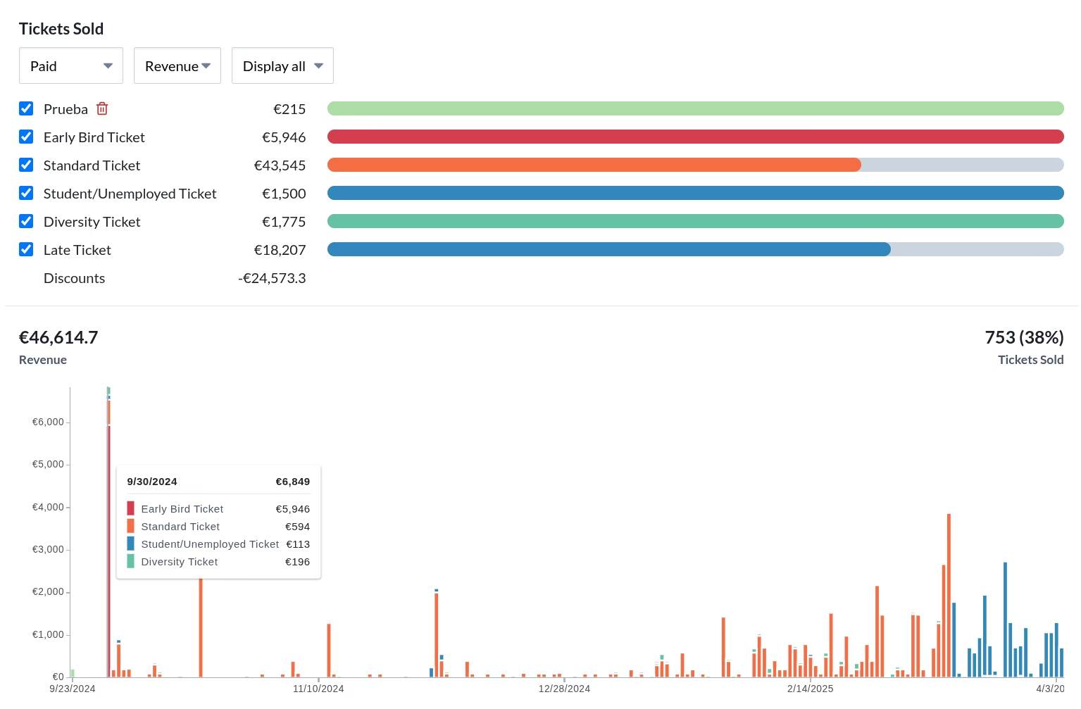
Under the chart there is a short list with the last ticket purchases.
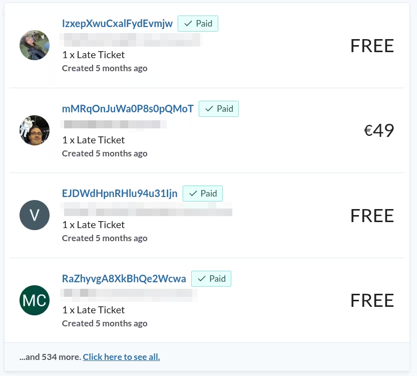
Chart filter
There is a set of controls above the chart to filter the information displayed:
- Ticket Status: The ticket status selector allows you to filter the chart by ticket status.
- Paid: Tickets that have been successfully paid for.
- Rolled Back: Tickets that were paid but later refunded or canceled.
- Timed out: Tickets that were not paid within the purchase time limit.
- Display metric: The second combo box allows you to choose the metric displayed in the chart.
- Tickets: The number of tickets sold. This is useful if you want to compare ticket sales that includes free tickets.
- Revenue: The total revenue generated from ticket sales.
- Date Range: The date range selector allows you to choose the period for which you want to display the data.
- Today, This week, This month: Displays data for the specified period in UTC timezone. This period (day, week or month) will be incomplete. If the event took place some time ago, the chart may be empty.
- Yesterday, Last week, Last month: Displays data for the previous period in UTC timezone. The data for the specified period will be complete.
- Display all: Displays all available data for the event.
Right below the filter components there is a list with all ticket classes, including those that were deleted at some point. Each ticket class has a bar displaying the number of tickets still available for sale. The bars are color-coded to match the chart below. You can hide a particular ticket class by unselecting the corresponding checkbox.
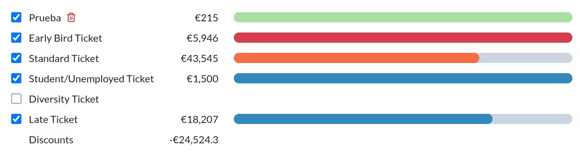
After the list of ticket classes you can find the total amount of discounts and extras.
Session charts
To display your session charts, select the Agenda tab under Event > Insights. If your event has a published agenda, you will see a chart displaying the feedback per session.
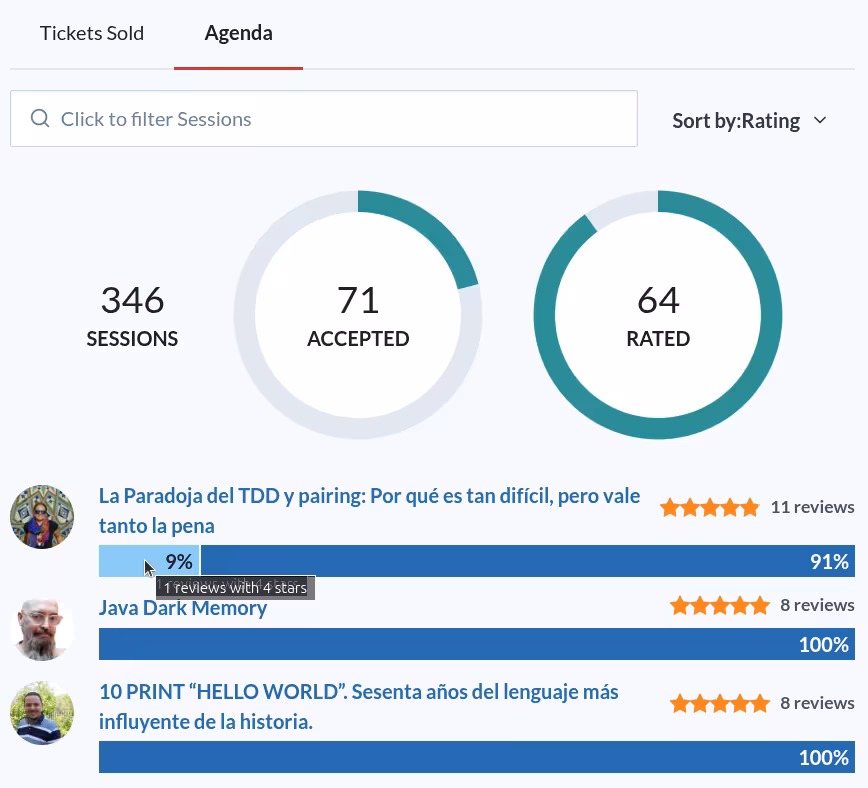
The chart displays at the top the total number of sessions received for the call for papers, the number of accepted (published) sessions and how many of those have received feedback.
For each session you can see the number of reviews, average star rating, and the number of ratings for each star level. You can hover over each session to see more details.
You can also filter and sort the sessions with the controls at the top of the list. For example, you can filter sessions about a particular topic, and sort from best to worst.
The sorting algorithm is based on the average rating, but it also considers the number of reviews. This means that a session with a high rating but few reviews will not rank as high as a session with a lower rating but many reviews.